Ratio-based type scale where every size relates to the others. Use when defining font sizes or type tokens, or when typography feels arbitrary.
193Sterne23Forks
Letzter Repository-Push
Originale Workflows für Websites, Bilder, Präsentationen und bewegte Inhalte.
Ratio-based type scale where every size relates to the others. Use when defining font sizes or type tokens, or when typography feels arbitrary.
Select, pair, and implement typefaces for web projects. Use when the user mentions "font pairing", "which typeface", "line height", "responsive typography", "web font loading", "type hierarchy", "variable fonts", "FOUT/FOIT", "typographic scale", or "the text is hard to read". Also trigger when choosing between system fonts and web fonts, optimizing font-loading performance, or designing readable long-form content. Covers readability evaluation, CSS implementation, and performance optimization. For overall UI design systems, see refactoring-ui. For dramatic typographic experiences, see top-design.
Set and review type scales, spacing, font features and text wrapping.
Audits font loading, type scales, measure, spacing, OpenType, and rendered punctuation with 78 scoped rules. Use when asked to "audit typography", "fix the fonts", or "review my type system". For a new visual direction use ui-design Direction; for general UI defects use ui-design Audit.
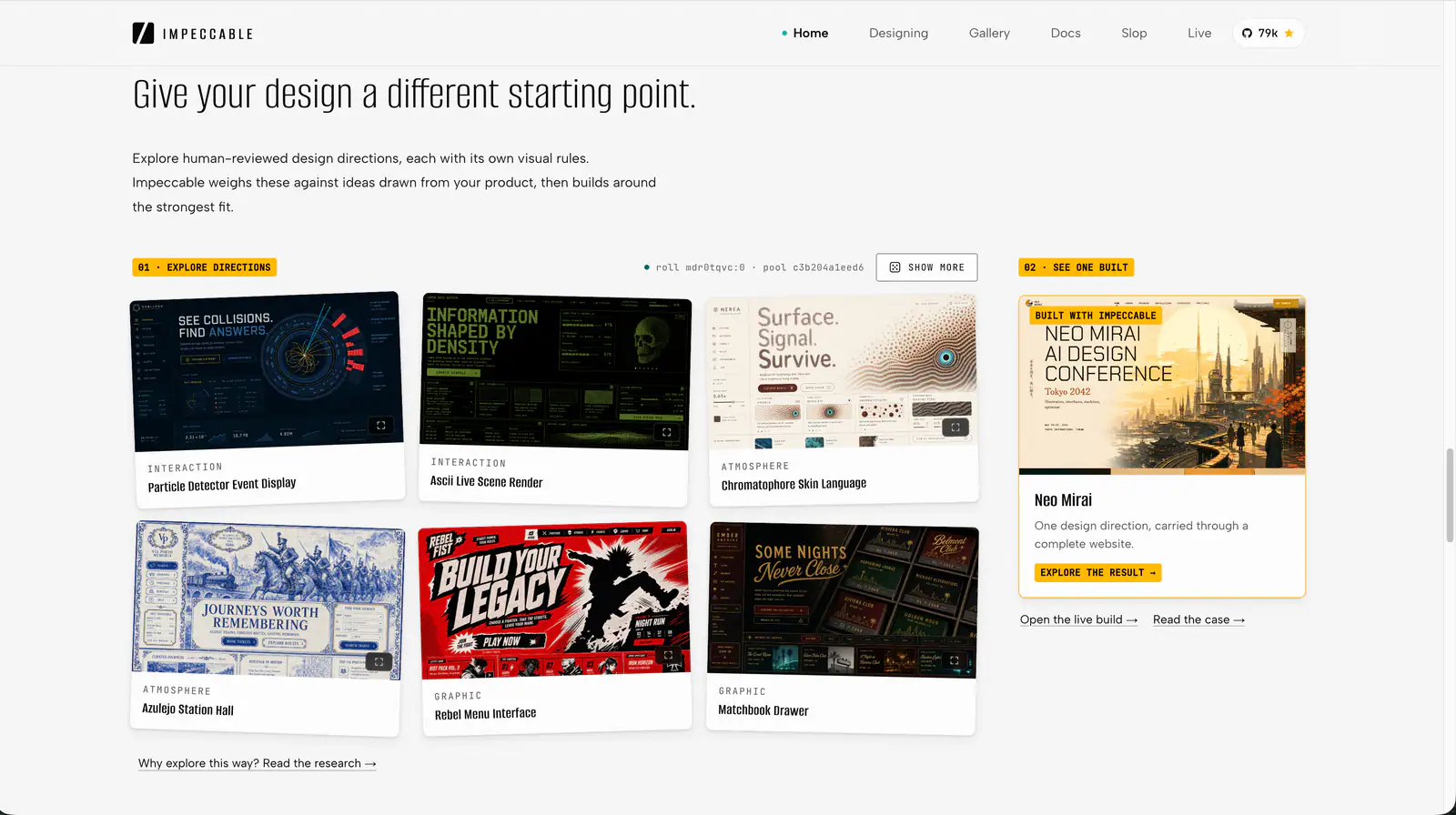
Impeccable is an AI frontend design Skill for building and refining interfaces: typography, layout, accessibility, responsive behavior and browser iteration.

Design guidance for AI coding agents: generate a project design system, search styles, colors and typography, and apply framework-specific UI/UX recommendations to web and app interfaces.
Quickly deslop UI code by fixing spacing, hierarchy, typography, and small layout issues. Use when the interface needs a fast cleanup or polish pass.
design skill for Claude AI. Grade A. Mobile app UI design expert for iOS and Android. Use when designing app interfaces, creating design systems, ensuring accessibility, or following platform guidelines. Covers Material Design 3, Human Interface Guidelines, color theory, typography, and 2025 trends.
Apply Anthropic’s documented colors and typography to documents, slides and other artifacts.
Review a screen or flow across accessibility, layout, copy, typography, color and UI polish.
Audit and fix visual hierarchy, spacing, color, and depth in web UIs. Use when the user mentions "my UI looks off" (or amateur/unprofessional), "fix the design", "Tailwind styling", "color palette", "visual hierarchy", "design system", "spacing scale", or "component styling". Also trigger when building consistent design tokens, creating dark mode themes, improving data-visualization clarity, or polishing UI details before launch. Covers grayscale-first workflow, constrained design scales, shadows, and component styling. For typeface selection, see web-typography. For usability audits, see ux-heuristics.
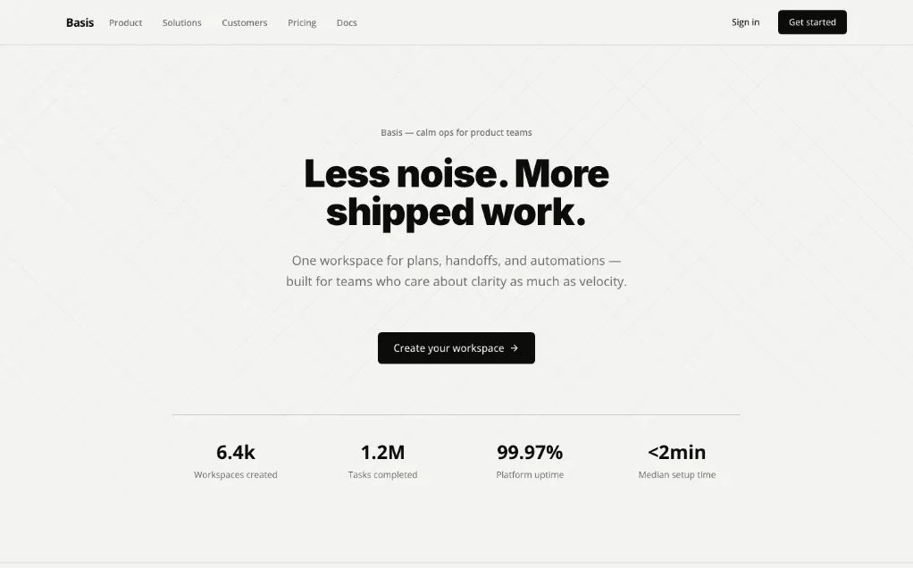
A unified design Skill library with selectable visual templates, reusable UI tokens, component rules and implementation checks for AI coding assistants.
Build native-feeling, benchmark-quality mobile app screens (Expo / React Native). Use when designing or implementing any mobile UI — screens, flows, onboarding, paywalls, tab bars, sheets, settings, empty states — or when polishing motion, navigation, typography, dark mode, or perceived performance. Enforces Apple HIG fidelity, semantic colors, native controls, anti-slop discipline, navigation semantics (push vs replace, modal vs sheet vs overlay, the one-way doors where back must not exist), purposeful Reanimated motion, a full-motion simulator-verified iteration loop, and a study-real-apps-first workflow (pairs with the Appllama MCP). Trigger on "build a screen", "make this screen better", "design the onboarding", "wire up this flow", "polish the UI", "make it feel native", or any mobile design/implementation task.
Apple's approach to interface design and fluid, physical motion, translated for the web. Use when building or reviewing gesture-driven UI, spring animations, drag/swipe/sheet interactions, momentum and interruptible transitions, translucent materials and depth, typography (optical sizing, tracking, leading), reduced-motion, or the design foundations (feedback, spatial consistency, restraint) behind Apple-style interfaces.
Turn vague UI feedback into focused changes using practical heuristics for spacing, typography, color, hierarchy, icons and interaction.
Structured UI design review — existing code (React/JSX, CSS, Tailwind) and, when behaviour matters, the running app in a real browser — reported as a prioritised Before / After / Why table. Covers visual hierarchy, spacing, typography, colour & contrast, component states, motion, responsiveness, accessibility, multi-page flow & navigation, and interaction continuity — grounded in Refactoring UI and Emil Kowalski's principles. For animation/jank/FPS, focus order, and cross-page UX it can drive Chrome via chrome-devtools-mcp to capture what a screenshot can't. Trigger when the user asks to "review this UI", "design review", "critique this component/screen/page or multi-page flow", asks why something "looks off", "looks AI-generated", or "looks like a wireframe", or wants to raise visual polish. For building UI from scratch use web-taste; for the full animation set see emilkowal-animations.
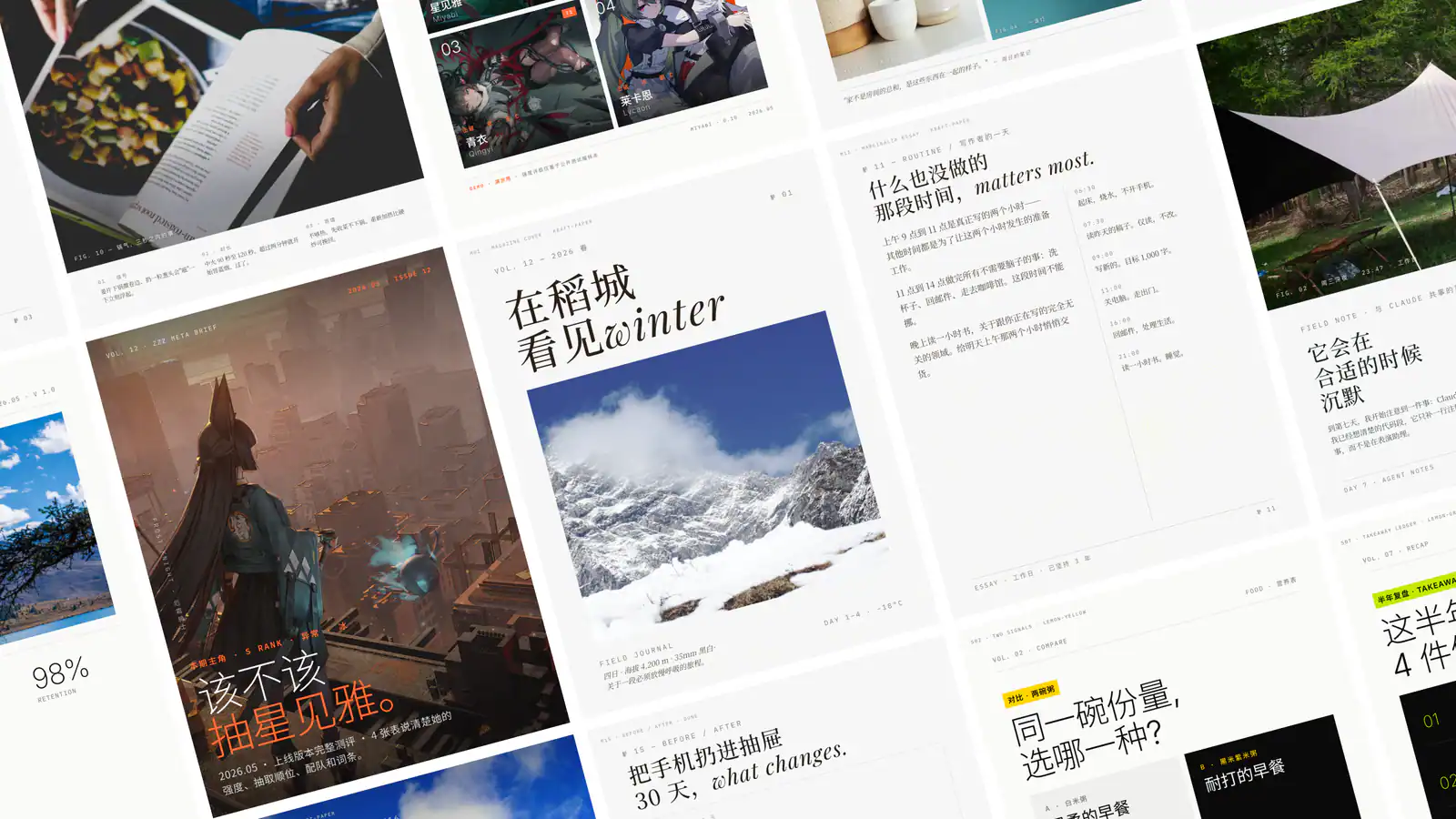
Create single-file HTML presentations in editorial magazine or Swiss style, with horizontal navigation, speaker notes, rehearsal timers and a synchronized audience window.
Build distinctive web interfaces with content-informed typography, composition and visual direction.

Direct code-based motion graphics for launch films, product promos, brand stings, and kinetic typography using explicit craft rules.
Polish frontend interfaces with concrete rules for typography, nested corners, shadows, icons, hit areas and restrained motion, plus structured quick or full reviews.
Use for UI design and implementation work to avoid generic AI-looking interfaces. Provides anti-slop rules, a required discovery phase before coding, and guidance for layout, typography, color, motion, accessibility, dashboards, tables, landing pages, theming, and polish. Trigger when editing UI code or reviewing and refining components, pages, screens, layouts, animations, responsive behavior, or design systems.
Create a semantic DESIGN.md with typography, color and interface guidance.
design skill for Claude AI. Grade A. SwiftUI frontend visual design skill. Creates beautiful, distinctive iOS/macOS interfaces that avoid generic AI slop patterns. Covers design direction, layout systems, typography, color, spacing, brand integration, and design review. Use when designing new SwiftUI views, reviewing UI quality, creating iOS prototypes, choosing visual styles, improving app aesthetics, or when the UI looks generic or AI-generated.
Plan visual designs using composition, typography, hierarchy and production constraints.