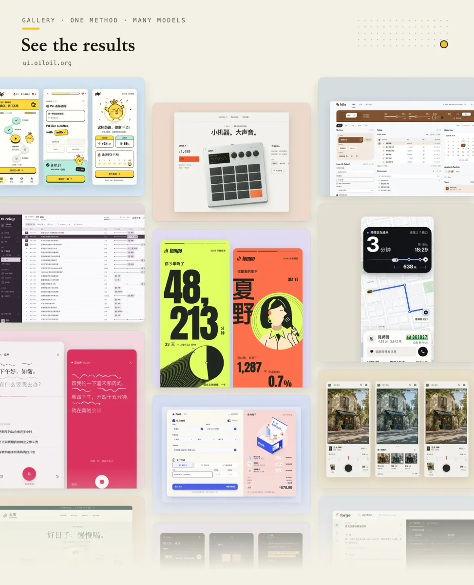
UI UX Pro Max
Design guidance for AI coding agents: generate a project design system, search styles, colors and typography, and apply framework-specific UI/UX recommendations to web and app interfaces.
Originale Workflows für Websites, Bilder, Präsentationen und bewegte Inhalte.
Design guidance for AI coding agents: generate a project design system, search styles, colors and typography, and apply framework-specific UI/UX recommendations to web and app interfaces.
Quickly deslop UI code by fixing spacing, hierarchy, typography, and small layout issues. Use when the interface needs a fast cleanup or polish pass.
design skill for Claude AI. Grade A. Mobile app UI design expert for iOS and Android. Use when designing app interfaces, creating design systems, ensuring accessibility, or following platform guidelines. Covers Material Design 3, Human Interface Guidelines, color theory, typography, and 2025 trends.
Build HUDs and menus with responsive anchors, safe areas, focus navigation, screen state, and event-driven updates.
Build multiple component variants in the real page and compare their tradeoffs.
Audit and fix visual hierarchy, spacing, color, and depth in web UIs. Use when the user mentions "my UI looks off" (or amateur/unprofessional), "fix the design", "Tailwind styling", "color palette", "visual hierarchy", "design system", "spacing scale", or "component styling". Also trigger when building consistent design tokens, creating dark mode themes, improving data-visualization clarity, or polishing UI details before launch. Covers grayscale-first workflow, constrained design scales, shadows, and component styling. For typeface selection, see web-typography. For usability audits, see ux-heuristics.
Implement an interface from a screenshot or mockup and compare the rendered result with the reference.
Route brand, UI, logo, presentation, banner, icon and social image tasks to bundled design workflows.
Find a small set of relevant interface examples to answer a specific design question.
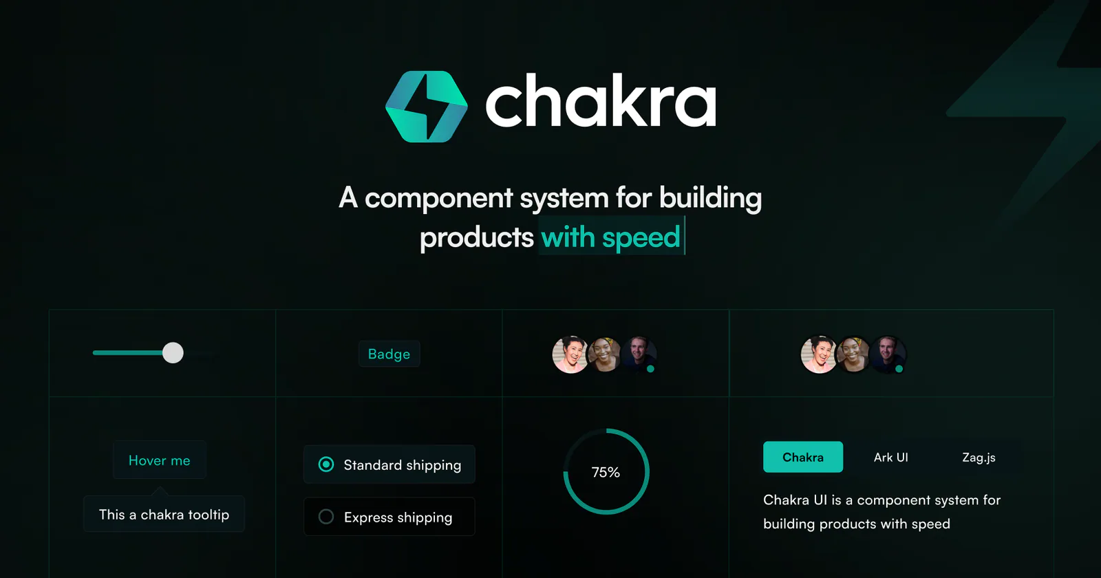
Upgrade Chakra UI v2 projects to v3 across packages, providers, components, and theming.
Build beautiful, native-feeling Expo screens. Covers Apple HIG styling, semantic colors, native controls, SF Symbols, media, visual effects, gradients, storage, and responsive layout. For routing and navigation, use the expo-router skill; for motion and animation, use the expo-animation skill.
Create strategic HTML presentation slides using layouts, design tokens and Chart.js visualizations.
Prepare comparable interface variants so the user can preview and choose a direction.
Explore and refine interface design through visual directions, same-screen style comparisons, screenshot review, and runnable UI deliverables.
Diagnose interface issues, make scoped visual improvements, and verify regressions through a three-phase workflow with persistent Markdown reports.
Guides Material UI theming and design tokens (createTheme, ThemeProvider, palette, colorSchemes, cssVariables, theme.vars, dark mode, TypeScript augmentation). Use when building or extending a theme, toggling light/dark, or aligning tokens across an app.
Stress-test UI components with realistic edge-case data and a switchable worst-case fixture.
Build, upgrade, and refactor Chakra UI v3 interfaces.
Use for UI design and implementation work to avoid generic AI-looking interfaces. Provides anti-slop rules, a required discovery phase before coding, and guidance for layout, typography, color, motion, accessibility, dashboards, tables, landing pages, theming, and polish. Trigger when editing UI code or reviewing and refining components, pages, screens, layouts, animations, responsive behavior, or design systems.
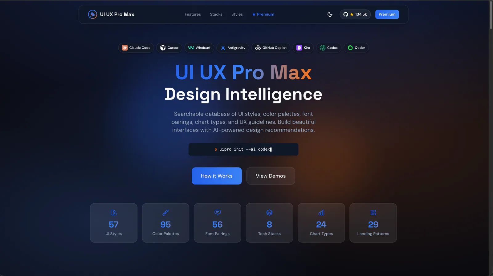
Build responsive Chakra UI v3 components, page layouts, providers, and reusable themes.
UIZZE workflows for improving interfaces, converting screenshots to UI, and finding relevant design references.
Build responsive interface components with shadcn/ui, Tailwind CSS and design-system guidance.
Build responsive UI components with project design systems, accessible interactions and complete application states.
Polish interface surfaces, icons and motion using the existing UI system.