Audit landing or checkout pages and prioritize potential conversion issues.
8Estrelas1Forks
Último push do repositório
Fluxos originais para sites, imagens, apresentações e tudo em movimento.
Audit landing or checkout pages and prioritize potential conversion issues.
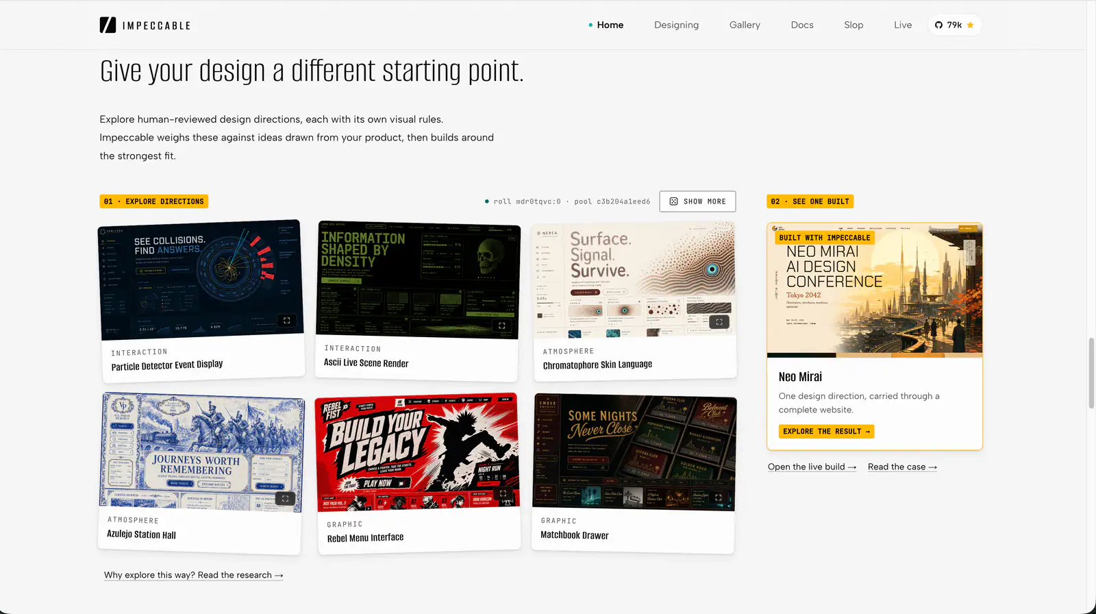
Impeccable is an AI frontend design Skill for building and refining interfaces: typography, layout, accessibility, responsive behavior and browser iteration.

Design guidance for AI coding agents: generate a project design system, search styles, colors and typography, and apply framework-specific UI/UX recommendations to web and app interfaces.
Quickly deslop UI code by fixing spacing, hierarchy, typography, and small layout issues. Use when the interface needs a fast cleanup or polish pass.
design skill for Claude AI. Grade A. Mobile app UI design expert for iOS and Android. Use when designing app interfaces, creating design systems, ensuring accessibility, or following platform guidelines. Covers Material Design 3, Human Interface Guidelines, color theory, typography, and 2025 trends.
Create a responsive 3D scene with module imports, a camera, WebGL renderer, animation loop, and OrbitControls.
Prevent and remove generic AI-generated design defaults, incoherent visual choices, and established UI defects while creating, revising, or reviewing websites, apps, screenshots, mockups, and design code. Use as a passive quality gate during UI work or for an explicit anti-slop cleanup; preserve the chosen art direction instead of forcing a neutral redesign.
Review a screen or flow across accessibility, layout, copy, typography, color and UI polish.
Build multiple component variants in the real page and compare their tradeoffs.
Web platform design and accessibility guidelines. Use when building web interfaces, auditing accessibility, implementing responsive layouts, or reviewing web UI code. Triggers on tasks involving HTML, CSS, web components, WCAG compliance, responsive design, or web performance.
Audit and fix visual hierarchy, spacing, color, and depth in web UIs. Use when the user mentions "my UI looks off" (or amateur/unprofessional), "fix the design", "Tailwind styling", "color palette", "visual hierarchy", "design system", "spacing scale", or "component styling". Also trigger when building consistent design tokens, creating dark mode themes, improving data-visualization clarity, or polishing UI details before launch. Covers grayscale-first workflow, constrained design scales, shadows, and component styling. For typeface selection, see web-typography. For usability audits, see ux-heuristics.
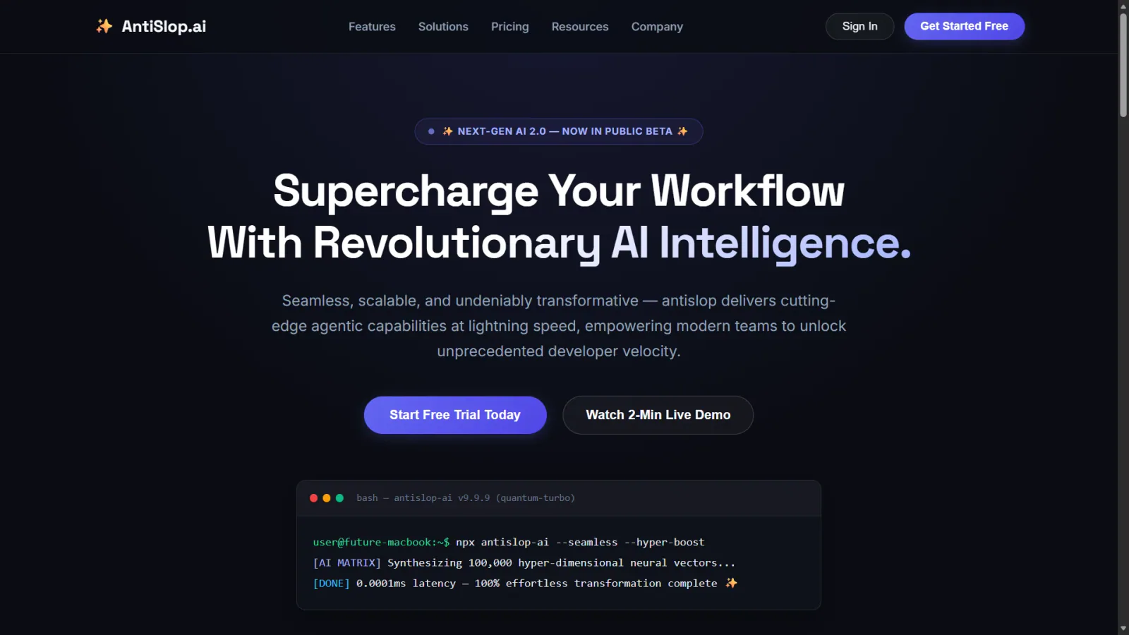
Human and accessibility skill for antislop. Contrast, keyboard, focus, and states for real people. Includes the contrast checker.
Work with Pinia stores, reactive state and store setup.
Survey a codebase's animation and motion code as a senior motion advisor, then produce a prioritized audit and self-contained implementation plans for other agents (or cheaper models) to execute. Read-only on source code — it plans improvements, it does not apply them. Use when the user asks to "improve the animations", "audit the motion", "make this app feel better", or wants a roadmap of animation fixes rather than a review of a single diff.
Structure a design critique around context, questions, observations, impact and actionable feedback.
Implement an interface from a screenshot or mockup and compare the rendered result with the reference.
Build or audit interface motion using context-sensitive design guidance and an HTML or terminal report.
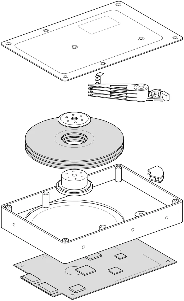
Turn technical concepts into interactive isometric machines: detailed SVG illustrations, WebGL effects and optional 3D motion, as HTML, SVG or React components.
Build multiple genuinely different versions of a UI piece you describe, rendered behind a visual picker so you can flip through them live and promote the one that feels right. Only runs when explicitly invoked; it does not trigger on its own.
Audit web accessibility using WCAG guidance, keyboard checks and evidence-led issue reporting.
Use Vue JSX and understand syntax differences from React JSX.
Render a chosen component in a temporary page under relevant stress scenarios.
Route brand, UI, logo, presentation, banner, icon and social image tasks to bundled design workflows.
Apple's approach to interface design and fluid, physical motion, translated for the web. Use when building or reviewing gesture-driven UI, spring animations, drag/swipe/sheet interactions, momentum and interruptible transitions, translucent materials and depth, typography (optical sizing, tracking, leading), reduced-motion, or the design foundations (feedback, spatial consistency, restraint) behind Apple-style interfaces.