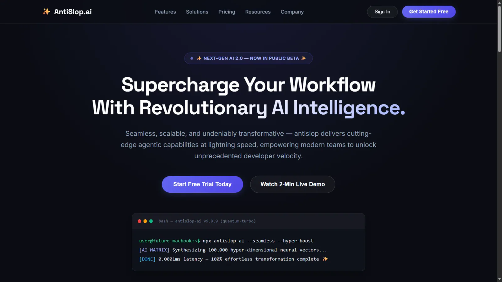
Designs and builds React/Next/Tailwind UI, audits visual and interaction defects, and stress-tests components with worst-case data. Use when asked to "build a landing page", "extract our design system", "add dark mode", "make this responsive", "remove UI slop", "audit this component", "stress-test this component", "break this UI", or "show me the worst case".
design skill for Claude AI. Grade A. Mobile app UI design expert for iOS and Android. Use when designing app interfaces, creating design systems, ensuring accessibility, or following platform guidelines. Covers Material Design 3, Human Interface Guidelines, color theory, typography, and 2025 trends.
Audit and fix visual hierarchy, spacing, color, and depth in web UIs. Use when the user mentions "my UI looks off" (or amateur/unprofessional), "fix the design", "Tailwind styling", "color palette", "visual hierarchy", "design system", "spacing scale", or "component styling". Also trigger when building consistent design tokens, creating dark mode themes, improving data-visualization clarity, or polishing UI details before launch. Covers grayscale-first workflow, constrained design scales, shadows, and component styling. For typeface selection, see web-typography. For usability audits, see ux-heuristics.
Build multiple genuinely different versions of a UI piece you describe, rendered behind a visual picker so you can flip through them live and promote the one that feels right. Only runs when explicitly invoked; it does not trigger on its own.
Apple's approach to interface design and fluid, physical motion, translated for the web. Use when building or reviewing gesture-driven UI, spring animations, drag/swipe/sheet interactions, momentum and interruptible transitions, translucent materials and depth, typography (optical sizing, tracking, leading), reduced-motion, or the design foundations (feedback, spatial consistency, restraint) behind Apple-style interfaces.
Structured UI design review — existing code (React/JSX, CSS, Tailwind) and, when behaviour matters, the running app in a real browser — reported as a prioritised Before / After / Why table. Covers visual hierarchy, spacing, typography, colour & contrast, component states, motion, responsiveness, accessibility, multi-page flow & navigation, and interaction continuity — grounded in Refactoring UI and Emil Kowalski's principles. For animation/jank/FPS, focus order, and cross-page UX it can drive Chrome via chrome-devtools-mcp to capture what a screenshot can't. Trigger when the user asks to "review this UI", "design review", "critique this component/screen/page or multi-page flow", asks why something "looks off", "looks AI-generated", or "looks like a wireframe", or wants to raise visual polish. For building UI from scratch use web-taste; for the full animation set see emilkowal-animations.
Guides Material UI theming and design tokens (createTheme, ThemeProvider, palette, colorSchemes, cssVariables, theme.vars, dark mode, TypeScript augmentation). Use when building or extending a theme, toggling light/dark, or aligning tokens across an app.
Use for UI design and implementation work to avoid generic AI-looking interfaces. Provides anti-slop rules, a required discovery phase before coding, and guidance for layout, typography, color, motion, accessibility, dashboards, tables, landing pages, theming, and polish. Trigger when editing UI code or reviewing and refining components, pages, screens, layouts, animations, responsive behavior, or design systems.
Select, pair, and implement typefaces for web projects. Use when the user mentions "font pairing", "which typeface", "line height", "responsive typography", "web font loading", "type hierarchy", "variable fonts", "FOUT/FOIT", "typographic scale", or "the text is hard to read". Also trigger when choosing between system fonts and web fonts, optimizing font-loading performance, or designing readable long-form content. Covers readability evaluation, CSS implementation, and performance optimization. For overall UI design systems, see refactoring-ui. For dramatic typographic experiences, see top-design.
This skill encodes Emil Kowalski's philosophy on UI polish, component design, animation decisions, and the invisible details that make software feel great.
ai-agents skill for Claude AI. Grade A. Bootstrap the Roblox skill pack in a game project by injecting a `## Roblox Skills` block into CLAUDE.md — the full game-development lifecycle map, every skill's purpose, use case, and trigger words, and the next-skill routing so each skill ends by telling the user what to run next. Also records the project's tracker (GitHub issues or local roadmap), triage labels, and UI design artifact layout. Run once when setting up a Roblox project, or if the skills seem to be missing lifecycle, tracker,...
UI/UX best practices for web interfaces. Use when reviewing animations, CSS, audio, typography, UX patterns, prefetching, or icon implementations. Covers 11 categories from animation principles to typography. Outputs file:line findings.
ui design
reference
952Estrelas47Forks
Último push do repositório
Uma pequena biblioteca feita com cuidado. Mais skills estão a caminho.