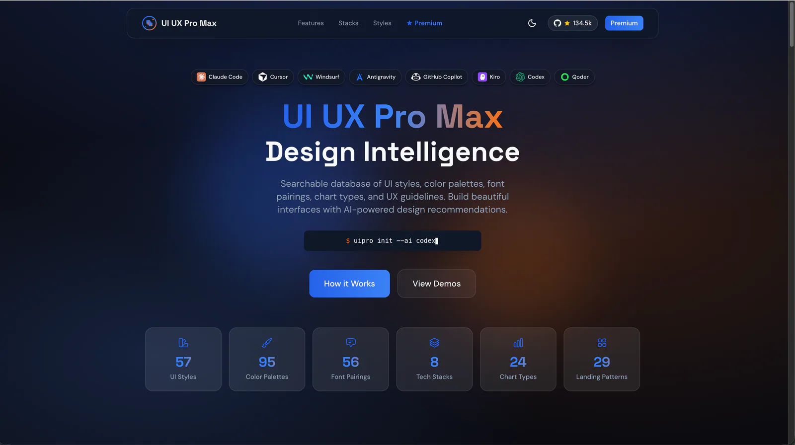
Design guidance for AI coding agents: generate a project design system, search styles, colors and typography, and apply framework-specific UI/UX recommendations to web and app interfaces.
Evaluate and improve interface usability using heuristic analysis. Use when the user mentions "usability audit", "users are confused", "form usability", "navigation problems", "Nielsen heuristics", "cognitive walkthrough", or "is this easy to use". Also trigger when reviewing a design for usability issues, improving form-completion rates, or evaluating information architecture and navigation. Covers Krug's laws, Nielsen's 10 heuristics, severity ratings, dark-pattern recognition, and accessibility. For visual design fixes, see refactoring-ui. For conversion-focused audits, see cro-methodology.
Walk through a live web app AS a real user to find usability + behavioural bugs that static reviews miss. REQUIRES proof of interaction (typing, clicking, sending, observing) before any verdict — a sweep that didn't interact terminates with verdict 'Incomplete'. Walks threads, exercises every element, runs the multi-pane stress matrix, visual polish sweep, component perfection checklist, automated a11y (axe-core), pragmatic performance budget (LCP/CLS/INP), scenario battery (11 scenarios), and stress recipes including the real-flavour data battery. Hard gates: console errors/warnings = 0, network 5xx = 0, layout collapse = 0, axe Critical/Serious = 0, perf budget green. Audit-the-audit meta-check rejects rushed reports. Each finding has reproduction steps, evidence path, and suspected code location. Trigger with 'ux audit', 'walkthrough', 'qa sweep', 'audit the app', 'dogfood this', 'check all pages', 'find what's broken', 'stress the UI'.
tools skill for Claude AI. Grade A. CLI utility to communicate with other CLI Agents or Scripts in other tmux panes; use it only when user asks you to communicate with other CLI Agents or Scripts in other tmux panes.
Audit and fix visual hierarchy, spacing, color, and depth in web UIs. Use when the user mentions "my UI looks off" (or amateur/unprofessional), "fix the design", "Tailwind styling", "color palette", "visual hierarchy", "design system", "spacing scale", or "component styling". Also trigger when building consistent design tokens, creating dark mode themes, improving data-visualization clarity, or polishing UI details before launch. Covers grayscale-first workflow, constrained design scales, shadows, and component styling. For typeface selection, see web-typography. For usability audits, see ux-heuristics.
A unified design Skill library with selectable visual templates, reusable UI tokens, component rules and implementation checks for AI coding assistants.