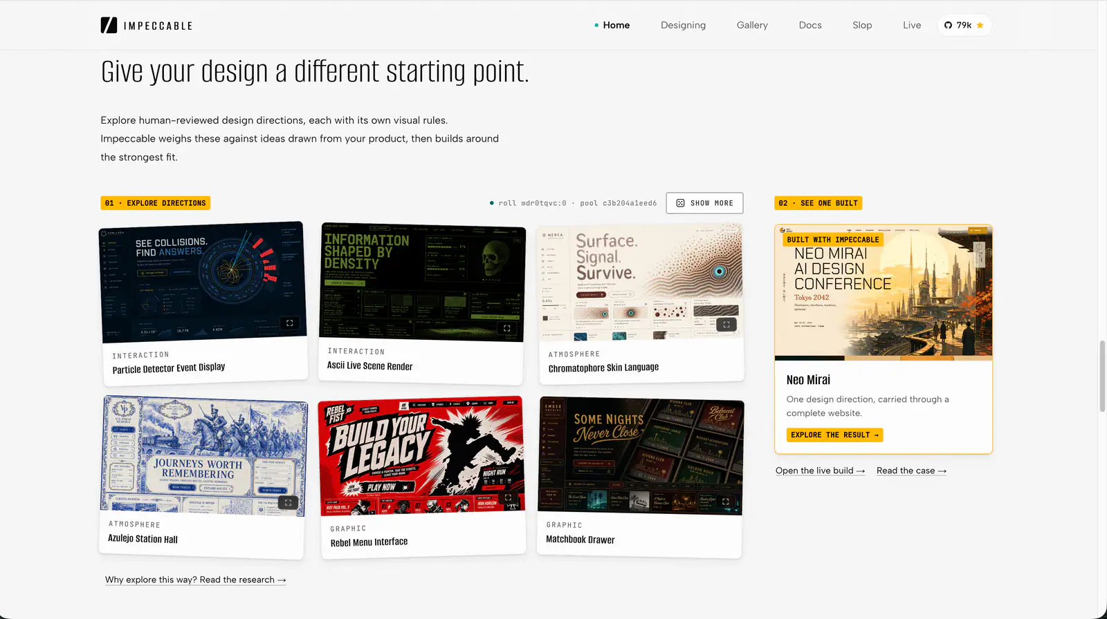
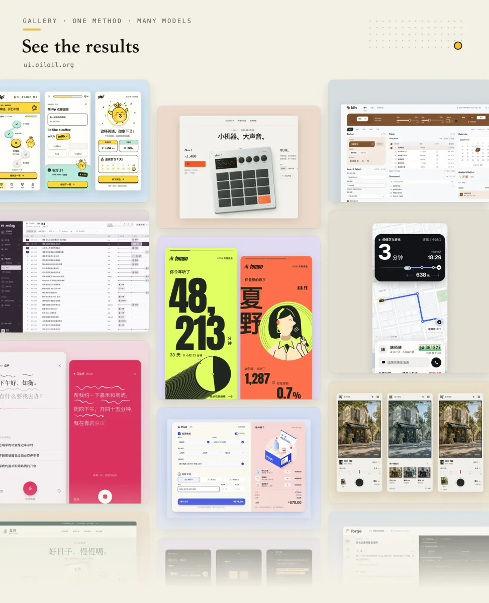
Impeccable is an AI frontend design Skill for building and refining interfaces: typography, layout, accessibility, responsive behavior and browser iteration.
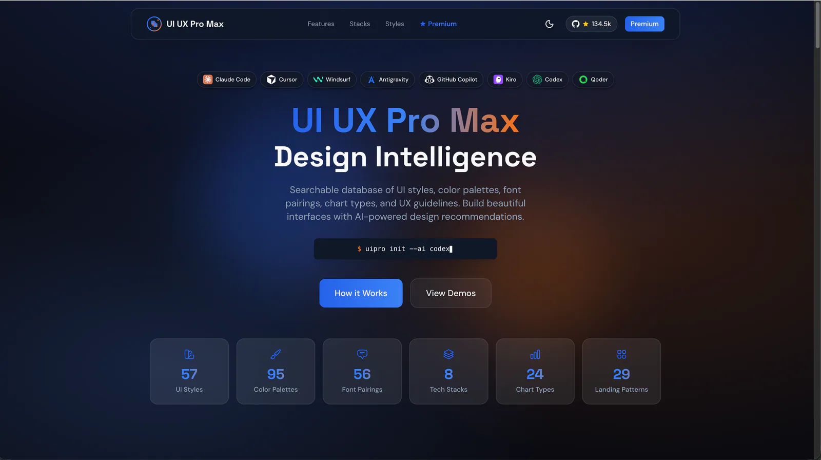
Design guidance for AI coding agents: generate a project design system, search styles, colors and typography, and apply framework-specific UI/UX recommendations to web and app interfaces.
Explore the individual skills in Anthropic’s official repository: documents, visual design, development and reusable workflows. Each entry includes its own introduction and two illustrative examples.
design skill for Claude AI. Grade A. Mobile app UI design expert for iOS and Android. Use when designing app interfaces, creating design systems, ensuring accessibility, or following platform guidelines. Covers Material Design 3, Human Interface Guidelines, color theory, typography, and 2025 trends.
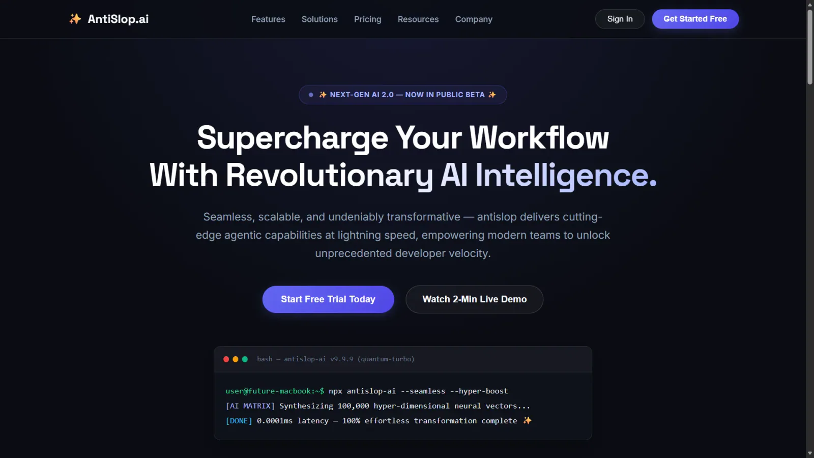
Prevent and remove generic AI-generated design defaults, incoherent visual choices, and established UI defects while creating, revising, or reviewing websites, apps, screenshots, mockups, and design code. Use as a passive quality gate during UI work or for an explicit anti-slop cleanup; preserve the chosen art direction instead of forcing a neutral redesign.
Web platform design and accessibility guidelines. Use when building web interfaces, auditing accessibility, implementing responsive layouts, or reviewing web UI code. Triggers on tasks involving HTML, CSS, web components, WCAG compliance, responsive design, or web performance.
Audit and fix visual hierarchy, spacing, color, and depth in web UIs. Use when the user mentions "my UI looks off" (or amateur/unprofessional), "fix the design", "Tailwind styling", "color palette", "visual hierarchy", "design system", "spacing scale", or "component styling". Also trigger when building consistent design tokens, creating dark mode themes, improving data-visualization clarity, or polishing UI details before launch. Covers grayscale-first workflow, constrained design scales, shadows, and component styling. For typeface selection, see web-typography. For usability audits, see ux-heuristics.
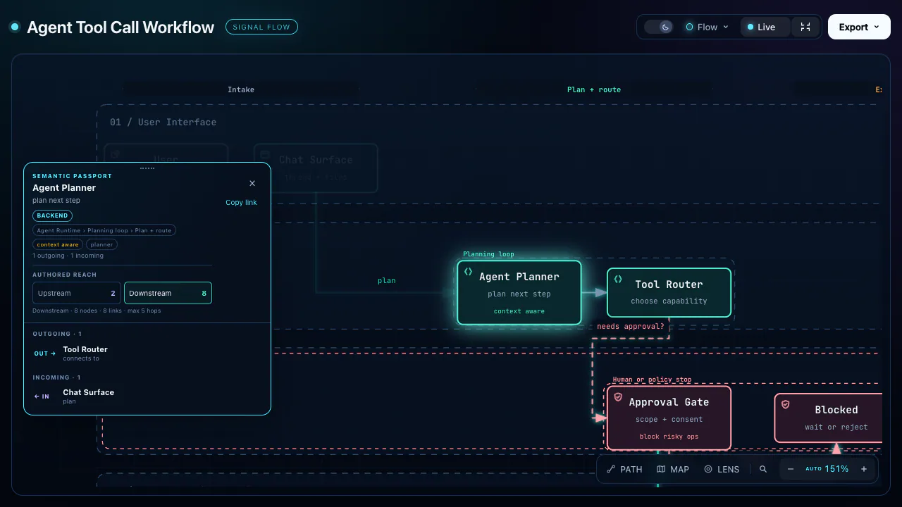
Turn technical concepts into interactive isometric machines: detailed SVG illustrations, WebGL effects and optional 3D motion, as HTML, SVG or React components.
Evaluate and improve interface usability using heuristic analysis. Use when the user mentions "usability audit", "users are confused", "form usability", "navigation problems", "Nielsen heuristics", "cognitive walkthrough", or "is this easy to use". Also trigger when reviewing a design for usability issues, improving form-completion rates, or evaluating information architecture and navigation. Covers Krug's laws, Nielsen's 10 heuristics, severity ratings, dark-pattern recognition, and accessibility. For visual design fixes, see refactoring-ui. For conversion-focused audits, see cro-methodology.
Build beautiful, native-feeling Expo screens. Covers Apple HIG styling, semantic colors, native controls, SF Symbols, media, visual effects, gradients, storage, and responsive layout. For routing and navigation, use the expo-router skill; for motion and animation, use the expo-animation skill.
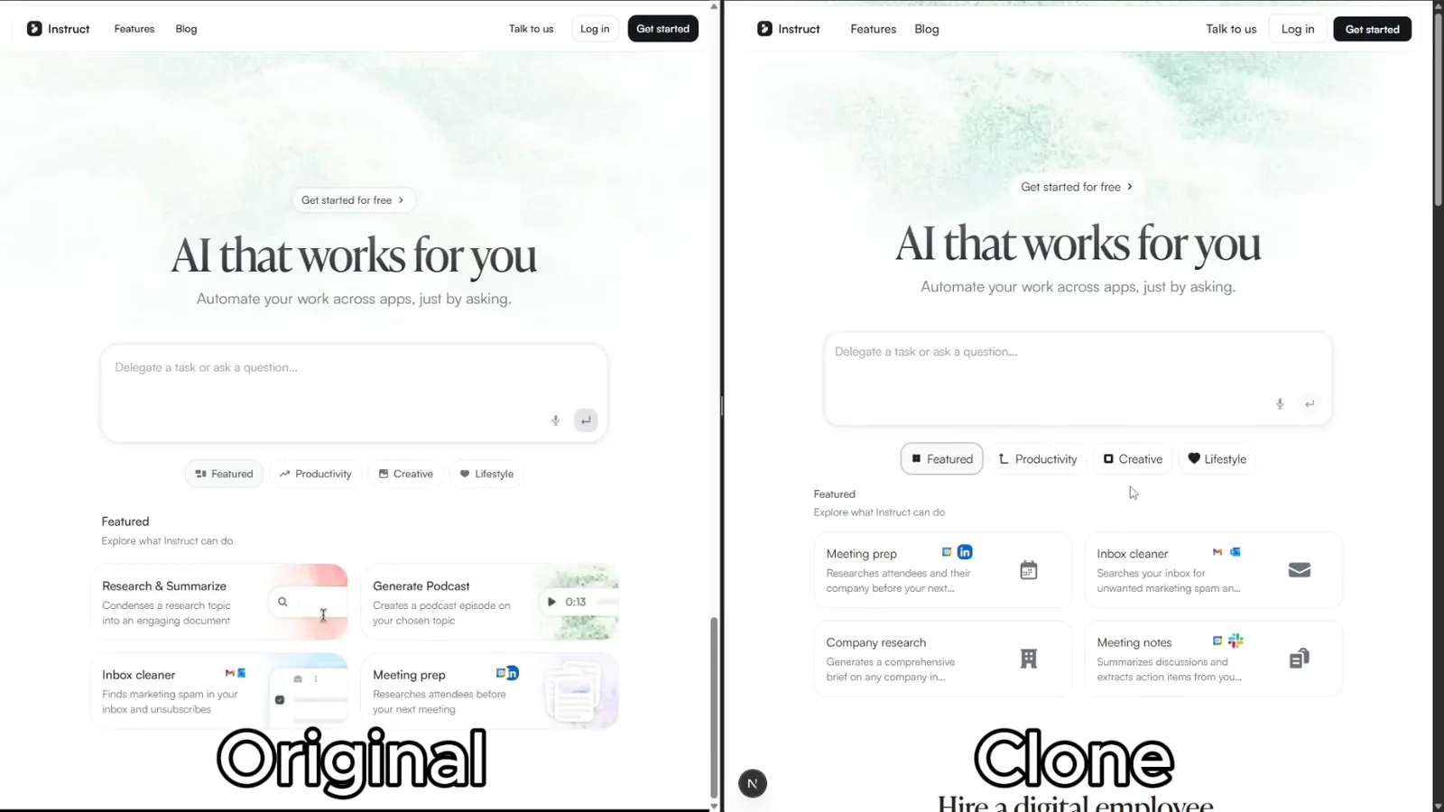
Rebuild reference websites as editable Next.js pages with an AI coding agent. Inspect responsive layouts, assets and interactions, then compare the result with the source.
Structured UI design review — existing code (React/JSX, CSS, Tailwind) and, when behaviour matters, the running app in a real browser — reported as a prioritised Before / After / Why table. Covers visual hierarchy, spacing, typography, colour & contrast, component states, motion, responsiveness, accessibility, multi-page flow & navigation, and interaction continuity — grounded in Refactoring UI and Emil Kowalski's principles. For animation/jank/FPS, focus order, and cross-page UX it can drive Chrome via chrome-devtools-mcp to capture what a screenshot can't. Trigger when the user asks to "review this UI", "design review", "critique this component/screen/page or multi-page flow", asks why something "looks off", "looks AI-generated", or "looks like a wireframe", or wants to raise visual polish. For building UI from scratch use web-taste; for the full animation set see emilkowal-animations.
Art-direct and implement distinctive, motion-rich marketing, editorial, portfolio, and landing websites with original reference-inspired imagery, standout heroes, GSAP choreography, one smooth-scroll engine, optional Three.js shaders, honest icon and logo sourcing, photo avatars, accessibility, and performance safeguards. Use when a user asks for an Awwwards-quality, premium, cinematic, interactive, high-concept, or motion-led website, or explicitly requests this visual and motion system.