Data Visualization & Dashboards Skills for Claude Code, Codex & AI Agents
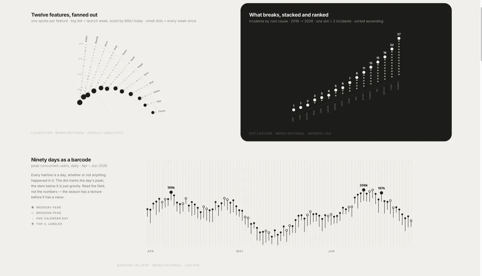
These skills help an agent turn data into a visual that answers a question. Members cover dashboards, scientific figures, Infographic and diagram tools, AntV maps, HTML artifacts, and slide charts.
Create publication-style Matplotlib charts with an AI agent, using scientific plotting conventions, reference scripts and print or vector export guidance.
Ship TanStack Charts with meaningful accessibility, deterministic SSR and hydration, correct adapter lifecycle, renderer and export choices, exact package subpaths, and explicit React Native validation.
Build consulting presentations from HTML slide parts with a design rulebook, automated checks, PDF output and an optional editable PowerPoint conversion.
Choose an honest visualization from a user story, metric, comparison, projection, target, or explanatory goal before selecting TanStack Charts marks. Load whenever a user asks to graph, chart, visualize, compare, forecast, project, explain, or communicate data.
Use this skill whenever the user wants to create, customize, or troubleshoot G2 v5 chart visualizations. Triggers include: any mention of 'G2', 'antv g2', '@antv/g2', 'G2 chart', 'G2 可视化', or requests to produce charts like bar charts (柱状图), line charts (折线图), pie charts (饼图), scatter plots (散点图), area charts (面积图), heatmap (热力图), radar charts (雷达图), treemap (矩形树图), funnel charts (漏斗图), sankey diagrams (桑基图), gauge (仪表盘), wordcloud (词云), boxplot (箱线图), as well as G2-specific topics like encode channels, scale config, coordinate systems, transforms, interactions, themes, labels, and animations. Also use when debugging G2 rendering errors, V4→V5 migration issues, or chart type selection. Do NOT use for G6 graph/network visualization, X6 editor diagrams, or S2 pivot tables.
How to choose Data Visualization & Dashboards skills
Choose a dashboard entry for interactive monitoring, a scientific figure skill for papers, and diagram or slide tools when the visual must explain rather than explore data.
Build a dashboard from a data table
Create a publication figure from experiment results