Free
UI & UX design
Awesome Design Skills
A unified design Skill library with selectable visual templates, reusable UI tokens, component rules and implementation checks for AI coding assistants.
3.6KStars340Forks
Repository last pushed
Bergside
These skills help an agent create, document and apply a design system so new screens stay consistent. Options include design guides, token extraction, shadcn/ui work, and theme generation.
21 skillsA unified design Skill library with selectable visual templates, reusable UI tokens, component rules and implementation checks for AI coding assistants.
Buttons, inputs, badges and pills share radius, colour logic, shadow, border and spacing. Use when building or reviewing a component library.
Design and refine dashboards, SaaS apps and admin interfaces with deliberate hierarchy, shared tokens, complete states and reusable design memory.
Guides Material UI theming and design tokens (createTheme, ThemeProvider, palette, colorSchemes, cssVariables, theme.vars, dark mode, TypeScript augmentation). Use when building or extending a theme, toggling light/dark, or aligning tokens across an app.
Extract a comprehensive design system (DESIGN.md) directly from frontend source code — React, Vue, Svelte, Angular, plain HTML/CSS, or any web framework. Analyzes component files, stylesheets, Tailwind configs, theme definitions, and design tokens to produce a rich, Stitch-compatible design system document. Use this skill whenever the user wants to reverse-engineer a design system from an existing codebase, audit the visual language of a project, extract design tokens from source files, or understand the styling patterns in a frontend repo — even if they just say "what does this app look like?" or "pull out the design from this code."
Derive a full UI palette from one or two brand colours — state variants, brand-tinted greys, semantic colours. Use when building or expanding a colour system.
Create an evidence-based DESIGN.md from a product repository or a rendered public website.
Ratio-based type scale where every size relates to the others. Use when defining font sizes or type tokens, or when typography feels arbitrary.
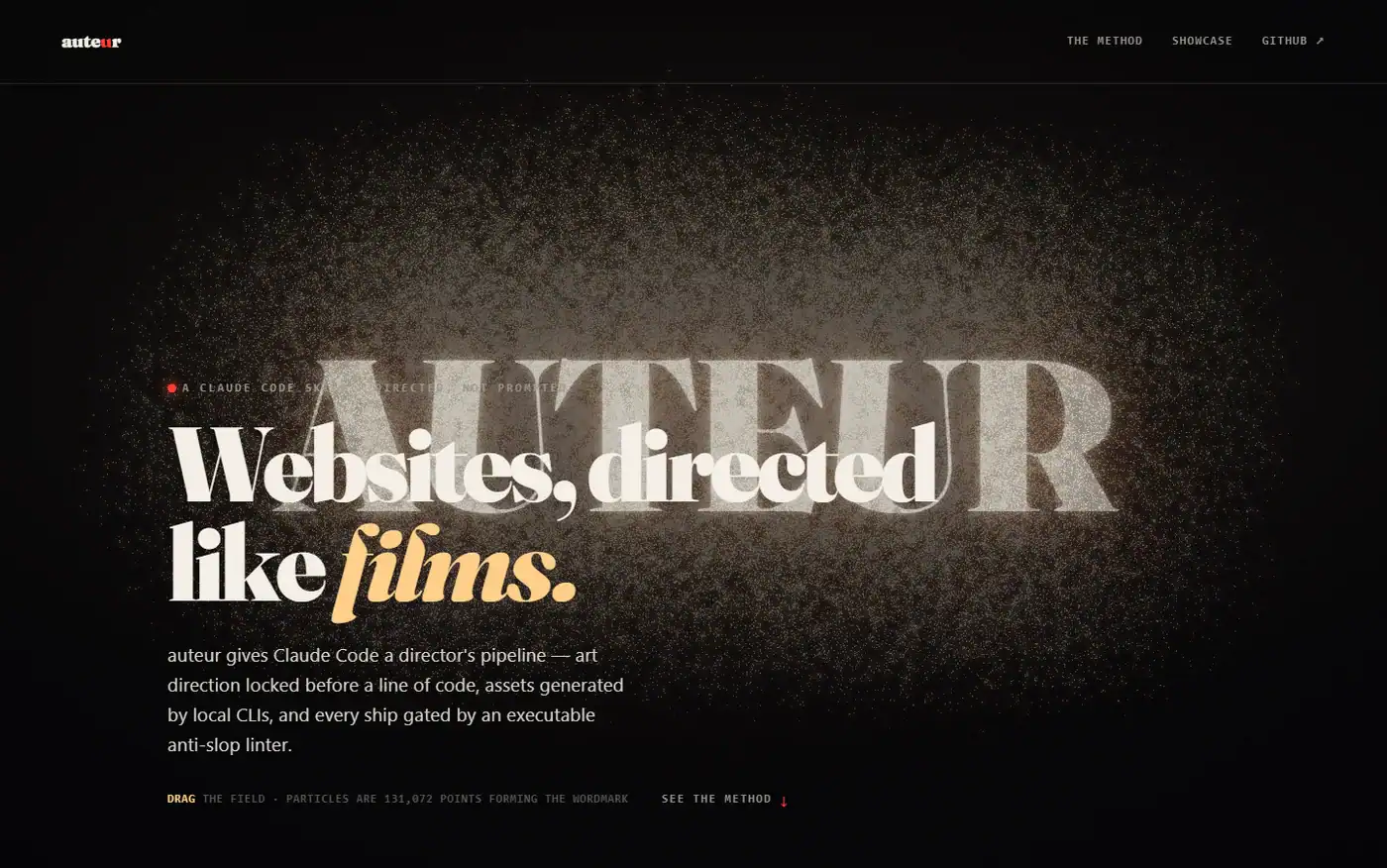
Design and build marketing pages, cinematic scroll experiences, and multi-screen products through a staged brief, asset, and implementation workflow.
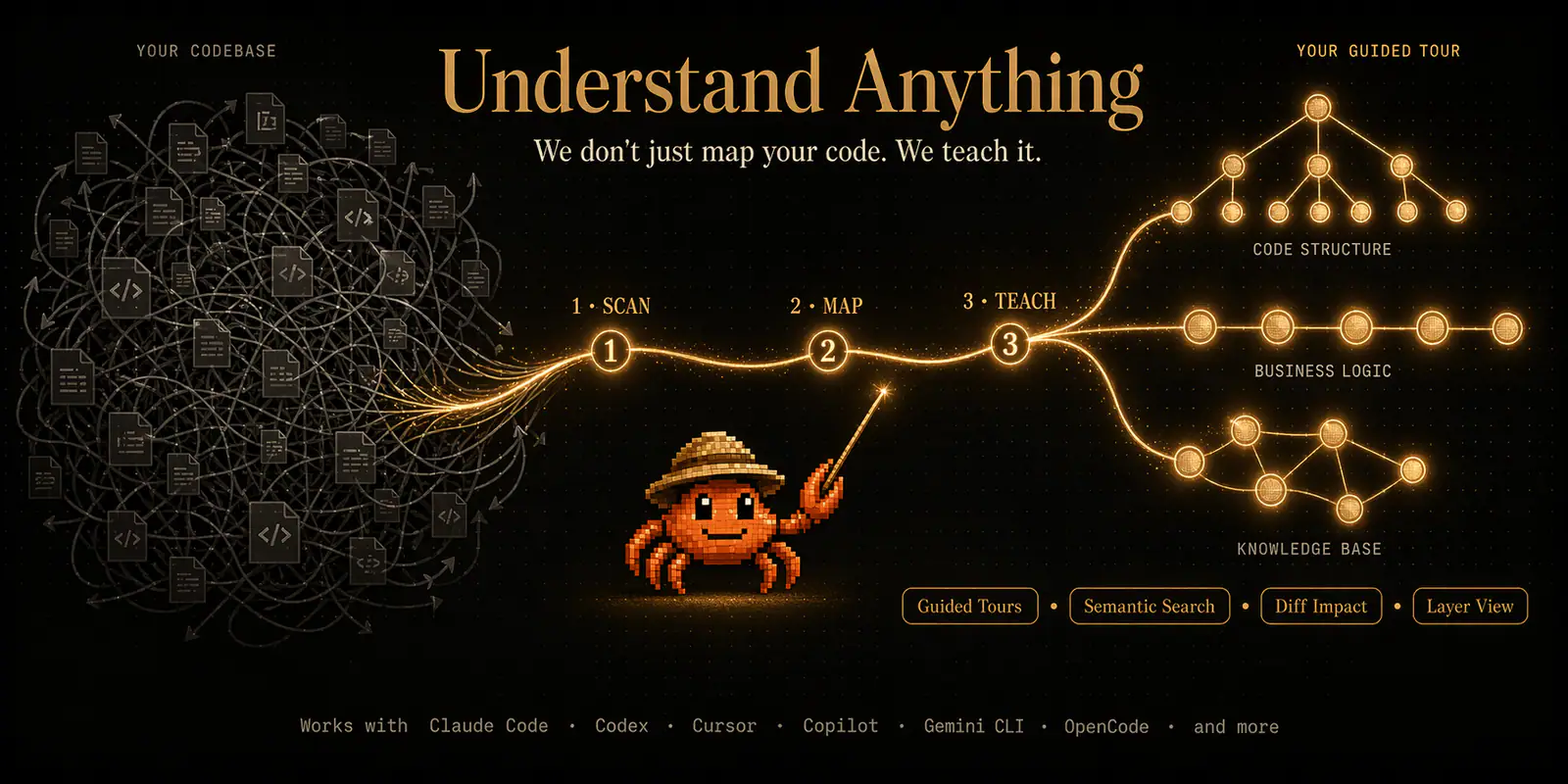
Analyze a Figma file into a graph of screens, components, instances and design tokens.
UI engineering workflows for recording and applying evidence-based design guidance.
Build and audit palettes, semantic color tokens and measured contrast.
Route UI work by product surface, define a visual concept, implement reusable tokens and states, and document the result in DESIGN_SYSTEM.md.
Extract a public website’s colors, typography and other design primitives into starter JSON and CSS tokens.
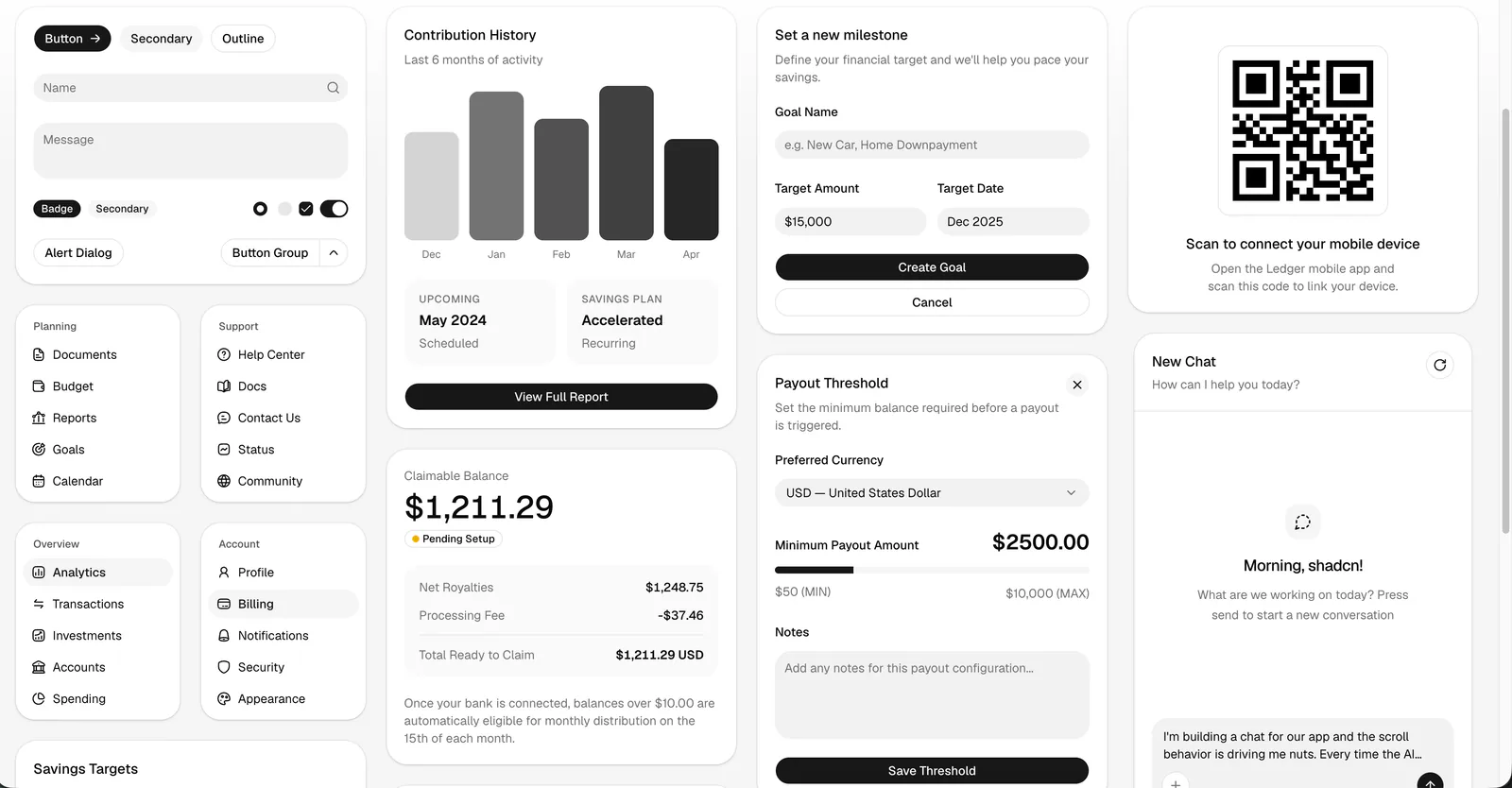
The official shadcn/ui skill for AI agents. Find, add, compose, customize, and debug UI components using your project configuration, current component docs, and the shadcn CLI.
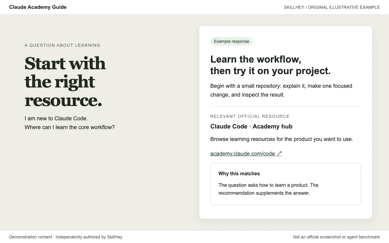
Apply one of ten documented color-and-font themes to existing artifacts, or create a custom theme.
Build and maintain a design system inside an Expo app - a reusable theme of design tokens (color, spacing, typography, radius, shadow, motion), reusable component structure with variant/size/state prop conventions, and rules for when to extract a repeated view into a shared component. Use when creating or organizing theme files and design tokens (theme.ts / theme/), extending an existing theme or styling library (NativeWind, Tamagui, Restyle, Unistyles) in its own idiom, standardizing styles so screens (including AI-generated ones) look consistent and polished, fixing an app that looks AI-generated or generic instead of native (the named native-slop tells), building an in-app component library, or auditing an app for design-system drift (hardcoded colors, spacing, fonts). For platform styling specifics (semantic colors, HIG rules, native controls) use expo-native-ui; for folder layout of a new app use expo-project-structure.
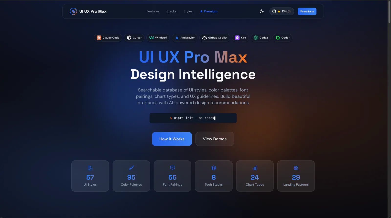
Develop layered design tokens, component specifications and design-to-code guidance.
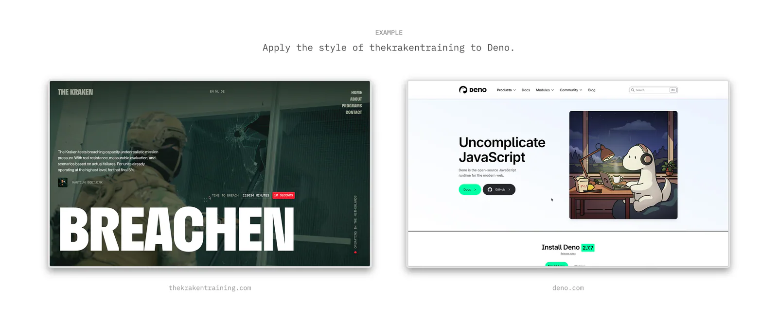
Extract and apply a design's tokens, qualitative style, and visual effects when defining a design direction or rebuilding an interface.
Set up Tailwind v4 + shadcn/ui themed UI with dark mode. Install deps, configure CSS variables via @theme inline, wire dark mode toggle, verify. Use whenever the user mentions Tailwind v4, setting up Tailwind theming, shadcn/ui colours, dark mode, or troubleshooting colours not working, tw-animate-css errors, @theme inline conflicts, @apply breaking after upgrade, or v3 → v4 migration issues.
React composition patterns that scale.
Compare AI design skills for design systems, shadcn/ui, frontend creation and interface refinement, with practical briefs to help you choose a workflow.
Extract a system from what you already have before inventing a new one; use the design guide skills when the goal is giving agents a written reference to follow.